Creative rebel, brand alchemist, and timeline architect, broadcasting truth from the edge of reinvention.
Hey, I'm Jasmina!
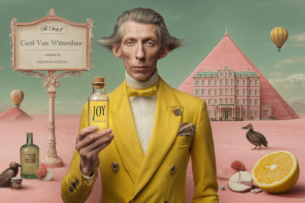
THE STORY OF CECIL VON WITTERSHAW
Imagine a world where joy is a forbidden commodity, bottled like perfume and regulated by law. Only the wealthy can afford to purchase it, making it a luxury item. Emotions have become a form of currency, traded on the new joy stock exchange market, similar to cryptocurrency. Billionaires compete to acquire rare and exclusive blends of joy. In response, a clandestine movement emerges, dedicated to cultivating and preserving sadness. Meanwhile, gods disguised as humans rebel, claiming the copyrights to every human emotion. This rebellion sets the stage for a series of conflicts and wars that begin to destroy or save humanity.
The official campaign cover for The Story of Cecil Von Wittershaw introducing the world of The Joy Police, The Mirage Hotel, and The License to Feel (3 Books, Part of the Cecil’s Universe). This is Cecil holding the last vial of JOY.
Welcome to License to Feel, a pastel dystopia where emotions are under surveillance and The Police controls joy in yellow suits. What if you needed a License to Feel, an official permit, wax sealed by a flamingo, stamped, numbered, and issued by the Joy Police as the only way to elevate, activate, and calibrate your frequency and mood, because emotions in this world, especially joy and desire, are not free.
This is the whimsical and cinematic world of CVW, a universe of color, characters, and absurd plot twists.
THE VISION
Before I started writing the book, there was Project Happiness. A single concept of what it means to be happy in today’s world and how much of it is fake. That idea grew into an illustrated world, a podcast, a novel, and soon, a visual series and maybe a film script. We shall see.
In this universe, happiness is a regime in couture. The way you process and display emotions and how much of it you own at the Joy Stock Exchange defines your worth. Every object in the story is created to support this so the surrealism of every scene carries the symbolism, parody and hidden meaning with fun and absurdity ands dry humor.
My objective was never to create images solely for the sake of it, but rather to design a campaign and illustrate my books. I aimed to evoke the profound sense of extreme happiness and joy, and to capture its essence and visual representation, particularly when it was mandatory. I sought to establish a visually cohesive brand identity that was magnetic, emotionally resonant, and exceptionally powerful, embodying the doctrine of extreme happiness.
THE COLOR
The yellow color is not merely a color; it is the protagonist and the branding. Just as pink is synonymous with Barbie, yellow represents the world of Cecil Von Wittershaw. It encompasses the uniforms, costumes, and characters of the Joy Police, symbolizing forced happiness, and serves as the psychological emblem of control in a world that reveres beauty and appearance.
Every decision and visual element, from wardrobe to typography, emanated from a singular frequency and was meticulously crafted to convey that singular truth. In Cecil’s narrative, aesthetics serve as the ultimate truth serum, shaping the world before dialogue and plot.
THE PROCESS
It all began with creating the visuals. I never intended to make a trilogy. However, the characters spoke to me, and the story simply wouldn’t let go. I wrote, illustrated, directed, designed, and built the universe from scratch. I dreamed and crafted the story in my Los Angeles apartment on the 28th floor, watching the stars and moon move across the sky. Many times, I thought I had completely lost my mind. I didn’t sleep for many nights and spent weeks confined to my house just to write. It took three years, much longer than I had anticipated, but I was determined not to give up and bring it to life. As I write this, I realize it all sounds absurd. Three years is an extended period to be fixated on a character and world, but this required an absolute, immersive, and deep dive into the yellow walls. In this life scenario, the line between art and life blurred so completely that even now I do question my sanity. At one point, I even shaved my head so I wouldn’t leave the house. Yes, this was the reason. I thought, “How can I eliminate all distractions and save time?” So I cooked a lot of pasta and shaved my head. That’s the truth.
THE WARDROBE
Cecil’s yellow suits are more than just fashion; they’re a form of psychological warfare. The bright yellow is designed to irritate your eyes, but then it’s calmed down by the exquisite couture cut and design. I intended for it to be that way, haha. I also added a lot of pink to balance out the intensity of the yellow. Every detail and design was meticulously crafted because I envisioned it like a casting call for a movie, and I wanted to consider what each character would wear. Not to mention, I wanted to reflect Cecil’s obsession with control. In a world where he’s losing control, he dresses to survive. The color you wear symbolizes the group you belong to. This is how the wardrobe became an integral part of the branding, the script, the aesthetic, and the theology.
THE MESSAGE
Every cinematic image carries a provocative questions:
Can happiness be mandatory? If emotion becomes a product, how much would it cost? Would you sell your soul for it if the price was right?
And…the final question of all, when love and power go head-to-head, which one wins?
QUANTUM LEAP energy with jasmina
the podcast
DOWNLOAD
to feel
licence
code
get your
Creative rebel, brand alchemist, and timeline architect, broadcasting truth from the edge of reinvention.